Pepper & Pint
A quirky restro-bar in Mumbai
Branding | Marketing
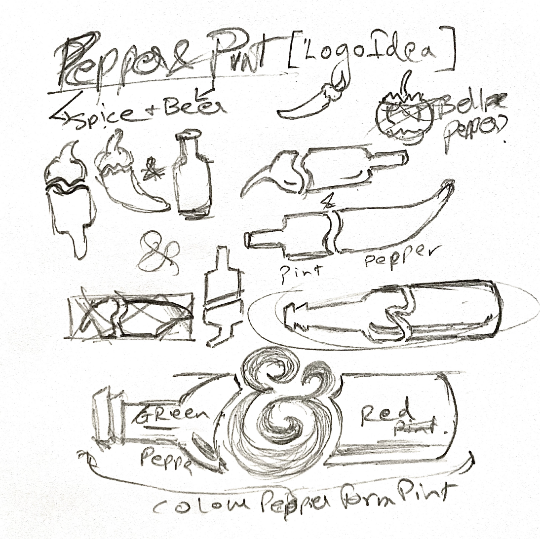
Pepper & Pint, a gastro bar nestled in one of Mumbai's bustling hubs, aimed to become the beacon for the city's vibrant youth. The challenge was to create an identity that wouldn't just blend in, but rather stand out and beckon the young crowd. The eureka moment arrived when we realized that the essence lay within its name. Drawing inspiration from it, the vibrant hues of peppers and the iconic shape of a pint became the foundation for the emblem.
The logo's dynamic design, infused with youthful flair, effortlessly captures attention, setting the stage for the bar's lively ambience. The typography, which elegantly straddles the line between sophistication and whimsy, further encapsulates the essence of the place. Every element, from colour to contour, comes together to promise an unforgettable experience at Pepper & Pint.


